WEB-APP DESIGN REFERENCES YOUR AI CAN INSTALL
Real screens, flows and sections. Searchable by your agent. Installable in one command.
233 full pages, 13 flows, 446 website sections and 89 component groups, all from one design system, axe-tested, free and MIT.
Pick anything. Your agent runs npx @properui/cli@latest add <name> or calls the MCP and gets the real source.
React 19 · Vue, Angular & HTML · MCP server · 143 axe suites, 0 violations · MIT, no paid tier
Proper UI by the numbers
818Searchable registry entries
89Published component groups
679Composable variants
143Automated axe suites
0Detected axe violationsin the markup those suites render; not a guarantee against every accessibility issue
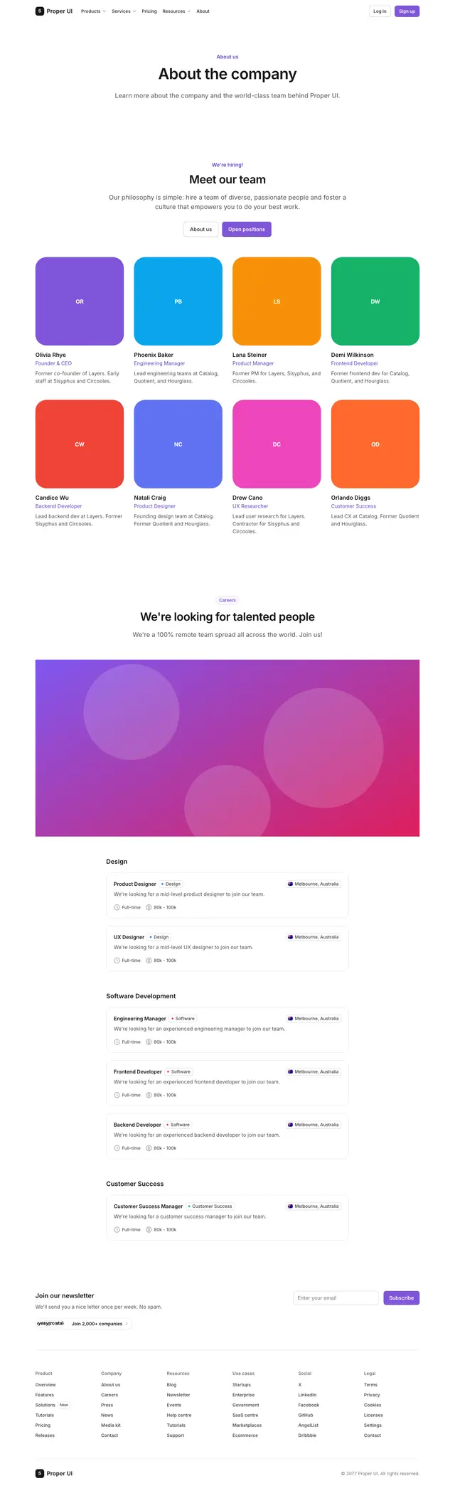
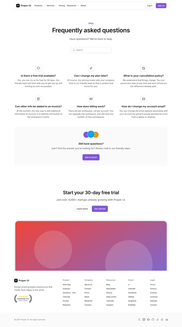
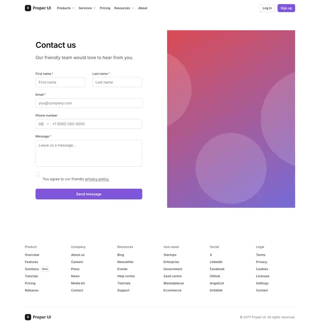
FLOWS
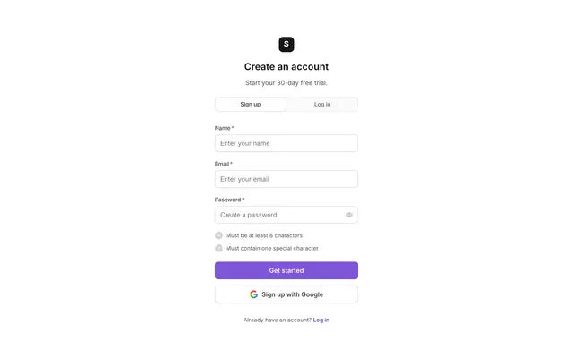
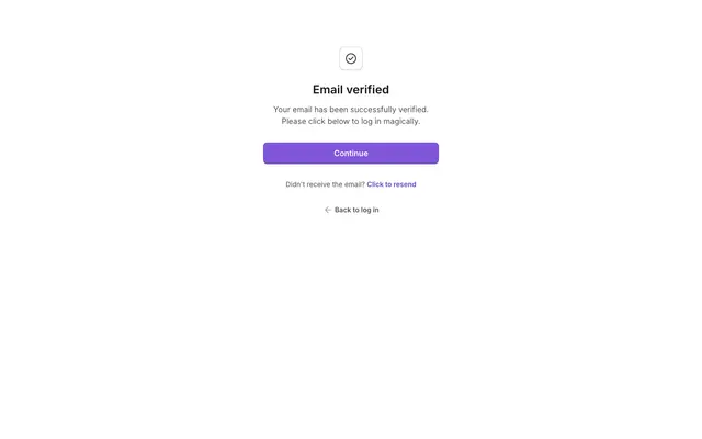
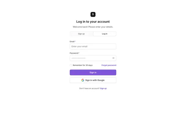
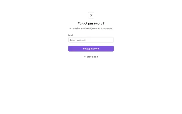
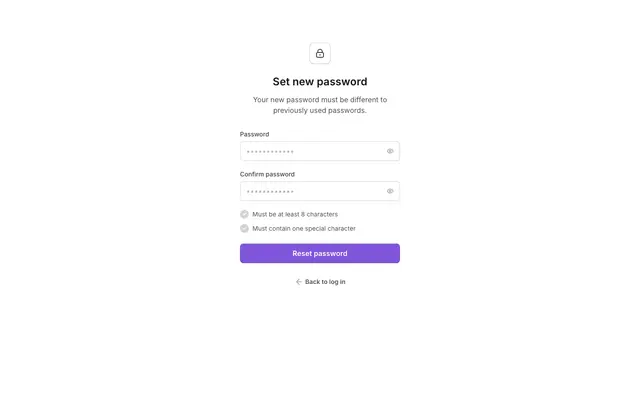
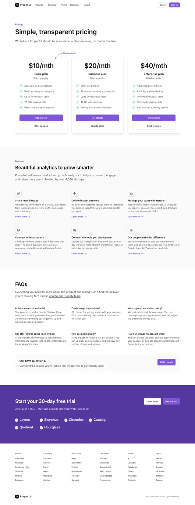
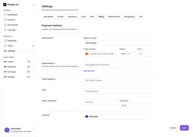
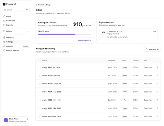
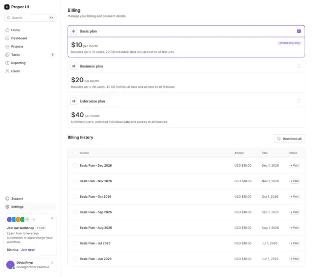
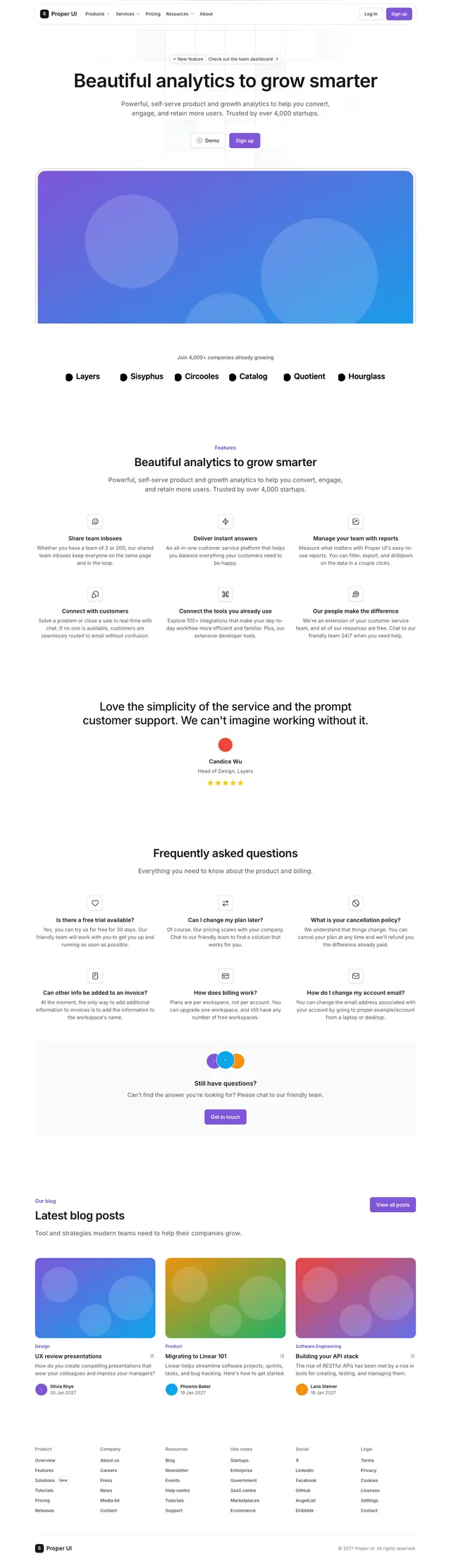
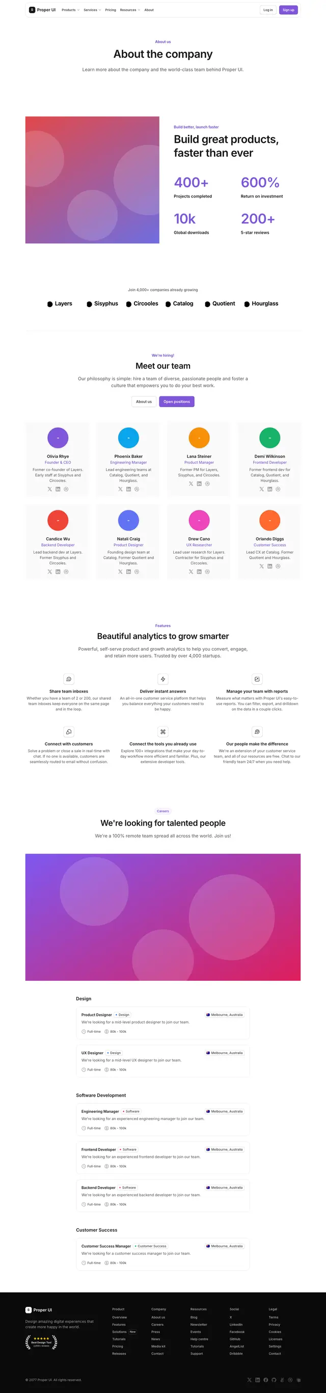
Whole journeys, not single screens.
Each flow is an ordered set of real pages your agent can install together.

Why these references
References you can ship, not screenshots.
Real source, not a picture
Every screen, flow and section is React 19, React Aria and Tailwind v4 source. Your agent installs it into your project instead of imitating an image.
One design system
Every reference is built from the same components and tokens, so screens stay consistent when the next prompt lands.
Accessibility tested
143 axe suites with 0 detected violations in the markup those suites render. Not a guarantee against every accessibility issue.
Tokens in one file
Colors, spacing, radius and type live in
theme.css. Change it once and every installed reference follows, so you can re-brand everything at once.Free and MIT
No account, no paid tier, no credits. Copy the source, edit it, ship it in commercial products.
Same prompt, two results
The difference
Two genuinely rendered screens, not illustrations. Both sides start from the same prompt.
The prompt
“Build a professional billing settings page with plan details, payment method, invoices and a cancellation action.”
Without Proper UI
Composed from bare TailwindBilling
Manage your plan and payment info.
Pro plan
$29 / month, billed monthly
8 of 12 seats used
Payment method
Visa ending in 4242
Invoices
| Date | Amount | Status | |
|---|---|---|---|
| Jun 1, 2026 | $29.00 | Paid | |
| May 1, 2026 | $29.00 | Paid |
- Invented or inconsistent component APIs
- Arbitrary spacing and colours
- Generic Tailwind composition
- Incomplete focus, error and empty states
- Style drift when a second screen is generated
With Proper UI
Real registry example- Real searchable registry components
- Shared semantic tokens
- React Aria interaction foundations
- Complete page or section examples where available
- Future screens reuse the same components and rules
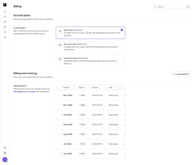
Registry example: settings-13: current plan, payment method and invoice history, built from Proper UI's table, badges and progress-indicators components. No example in the registry has a dedicated cancellation control yet, so that part of the prompt above is shown as asked rather than claimed as delivered.
Same tokens, every screen
One system. Every screen stays consistent.
Your agent reuses the same components, semantic tokens and interaction patterns instead of redesigning the product with every prompt.
- Typography scale
- Spacing rhythm
- Buttons and inputs
- Cards and borders
- Semantic colours
- Focus, loading, error and disabled states
Switching the preset changes the brand colour scale and corner radius across every screen in your product, not just the three below.
Ways to use it
Browse it, search it from your agent, or install it directly.
On the site
Browse screens, flows and sections, open any of them in a live preview, and copy the add command for the one you want.
Browse the libraryThrough the MCP
Add one URL to Claude, ChatGPT, Codex, Cursor or Gemini CLI and your agent searches the library itself. Prefer to run it locally? Use the stdio package.
Remote URL
https://properui.dev/api/mcpLocal (stdio)
See the MCP setup npx -y @properui/mcpThrough the CLI
Install by name, search the registry, or ask which framework and aliases your project already uses.
Install
npx @properui/cli@latest add <name>Project facts
Read the CLI docs npx @properui/cli@latest info --jsonThrough the Skill
A durable skill or rule that tells your agent to search Proper UI before it writes UI code.
Project setup
npx @properui/cli@latest agent initOr from skills.sh
Read the agent guide npx skills add properui/properuiFor AI coding agents
Set up your agent in minutes.
Each command configures the current project: it writes a durable skill or rule and registers the MCP server, so your agent searches Proper UI before it writes UI code. Any other MCP client connects with one line.
Claude Code

Run in your project terminal
npx @properui/cli@latest agent init --client claudeCreates: .claude/skills/properui/SKILL.md and CLAUDE.md and .mcp.json
Codex

Run in your project terminal
npx @properui/cli@latest agent init --client codexCreates: .agents/skills/properui/SKILL.md and AGENTS.md
Cursor

Run in your project terminal
npx @properui/cli@latest agent init --client cursorCreates: .cursor/rules/properui.mdc and .cursor/mcp.json
Lovable

Paste into Project settings, Knowledge, Custom instructions
Lovable runs in the browser and cannot read local project files, so it gets the same instructions through its Knowledge panel.
Destination: Project settings > Knowledge > Custom instructions
Any MCP client

Add as a stdio MCP server in your client
npx -y @properui/mcpWorks with any client that speaks MCP, such as Windsurf, VS Code, Zed or Gemini CLI. Your assistant gets search_components, get_component, add_component and four more tools.
Add to: your client's MCP server list
Universal setup
Runs the local install for Claude Code, Codex and Cursor in one pass, then prints the Skill URL and Knowledge instructions for Lovable, since Lovable cannot read local project files.
npx @properui/cli@latest agent init --client allA real session
One prompt in Claude Code. One production billing page.
No catch
Open source. Your code. No runtime lock-in.
- Installed source is inspectable and customizable.
- Developers are not tied to a hosted visual runtime.
- Components use TypeScript and semantic tokens.
- Interaction foundations use React Aria where documented.
- The repository and license are directly accessible.
Or fetch the raw catalog directly: GET /r/index.json.
26Base components
45Application groups
18Marketing sections
233Full-page examples
143Automated axe suites
0Detected axe violations
Violations detected in the markup those suites render, not a guarantee against every accessibility issue.
Before you start
Frequently asked questions
How is this different from a library of screenshots?+
The references are components with source, not pictures. Your agent installs the one it picks, with its tokens and accessibility behaviour, instead of imitating an image and guessing the markup.
Where do the screens come from?+
They are built in this repository from one design system. Demo data and assets are placeholders, and nothing is scraped from other products.
Why does AI need a UI library designed for agents?+
Without one, an agent invents markup, class names and layout decisions from memory on every prompt, so screens drift from each other. Proper UI gives it a registry it can search and real component source it can install, instead of guessing an API.
How is Proper UI different from shadcn/ui?+
The install workflow is shadcn-style: the CLI copies real .tsx source into your project rather than adding a runtime dependency, and Proper UI also publishes a shadcn-compatible registry namespace so npx shadcn add @properui/<name> works. The components themselves differ: they are built on React Aria Components rather than Radix, styled with Tailwind CSS v4 semantic tokens, and the agent surface is a dedicated CLI (info, search, add) plus a Skill and /llms.txt, not just component files.
Does the agent use real components or generate approximations?+
Real components. The CLI copies actual source files from the registry into your project; nothing is generated from a text description. The Proper UI Skill tells an agent to search the registry and install with the CLI before writing any markup by hand.
How does Proper UI keep screens consistent?+
Colors, spacing and other values live in one shared semantic token file (packages/ui/src/styles/theme.css) rather than being hard-coded into each component. Every screen that reuses the same installed components inherits the same tokens and the same Skill rules automatically, across every screen in your product.
Can I use Proper UI in an existing Tailwind project?+
Yes, but check for collisions first: Proper UI declares bg-*, text-*, border-*, ring-* and outline-* primary/secondary utilities that can silently win over (or lose to) an existing theme's utilities of the same name. The adopting guide documents which side wins for each collision type and how to migrate safely.
What does the agent setup command change in my repository?+
Exactly what each tool's setup card lists: a SKILL.md or rule file, a short pointer or marked block appended to CLAUDE.md or AGENTS.md where applicable, and a properui entry for the MCP server in .mcp.json or .cursor/mcp.json, merged into any servers already there (--no-mcp skips it). Nothing else in the project is modified, and re-running the command only updates those sections in place.
Can I customize the installed components?+
Yes. The CLI copies real .tsx source into your project, so you edit it like any other file you own. Run npx @properui/cli@latest diff to see how an installed component has drifted from the current registry version before deciding whether to update it.
Does it work with Claude Code, Codex, Cursor and Lovable?+
Claude Code, Codex and Cursor each get a one-command setup that writes a skill or rule file directly into the project, and any assistant that speaks MCP can connect to npx -y @properui/mcp to search the registry and install components as tools. Lovable runs in the browser with no access to local files, so it uses the same instructions pasted into its Knowledge panel instead. v0 and Bolt have no agent init for them, but can read Proper UI's documentation and /llms.txt directly.
Can I use Proper UI without React?+
Partly. The full library is React. Vue, Angular, Svelte, Astro and plain-HTML projects get the same tokens through @properui/tokens (including a prebuilt stylesheet you can link from a CDN), about twenty components as HTML classes with small vanilla-JS behaviours in @properui/html, and matching custom elements such as <pui-button> in @properui/elements. Data tables, charts, date pickers, the marketing sections and the page examples stay React-only; the frameworks page lists exactly what each platform gets.
Can I use Proper UI in commercial applications?+
Yes. Proper UI is MIT licensed, including every base component, application screen and marketing section. There is no account and no paid tier.
Is any private application code sent to Proper UI?+
No. The CLI only fetches registry JSON over HTTPS, from properui.dev or a local directory you point it at, and has no telemetry. It does not read or transmit your application code, and the documentation site itself is static.
Give your AI a real design system.
Set up Proper UI once. Then build complete, consistent interfaces with Claude, Codex, Cursor or Lovable.
Or set up every agent at once
npx @properui/cli@latest agent init --client all